Showing posts with label Paint. Show all posts

Friday, November 22, 2013

Sap Green (Part 2)

In Part 1 I described the discovery of Buckthorn growing in my small upstate New York garden, it's identification and subsequent production of berries. On September 4, 2013 I picked and sorted these berries into what you see below.

Buckthorn berries in three stages of ripeness; 28g of unripe green; 30g of medium-ripe blush; and 117g of ripe purple-black.
The period art manuals offer a variety of methods for creating the colour we know as sap-green, which all seem to be variations on squeezing the juice of the berries through a cloth, adding alum, sometimes ley and then storing it. This post will concentrate on the methods that DON'T use ley.

PADUAN MANUSCRIPT - Merrifield, 662
31. How pasta verde [sap green] is made. - Take the grains or berries of the buckthorn when they are quite ripe, and this will be about the end of September; let them soften for 7 or 8 days in a vase with water in which roche alum has been dissolved in the proportion of 1 ounce of alum to 6 of the berries, and boil it well until nearly half the water is consumed; then cool it, strain it through a linen cloth, put the part that is strained into pigs' bladders, and dry them in the sun or smoke; and this is called "pasta di vesicha."

Prep: Six individual ripe berries doesn't even register weight in grams ounces, therefore I am going to make the obvious leap that the above recipe means 1oz of alum to 6oz of berries. I do not have enough berries for that measurement therefore I am going to use 1oz (28.3g) of berries and divide that by six for the correct amount of alum, which is 4.67g.

The recipe doesn't specify an amount of water so I poured in an amount equal to approximately 2 inches in depth (yes, I should have measured), this will cover the berries by the same depth that they take up. Using a double-boiler setup I warmed the distilled water and alum in the glass jar just enough so that the alum completely dissolved, then removed it from the heat and allowed it to cool. This alum water gives me a ph3 (leaning towards ph4).

No mention is made about crushing or pounding the berries so I didn't. When pouring the berries into the water it immediately took on a green hue and it will be interesting to see how this deepens (if it does) over the course of the next week. All of the berries except a few are hanging out on the bottom of the jar, only a few are floating around on the top of the liquid or just under it's surface.

This was repeated with the green unripe berries, and then the semi-ripe blush berries using the methods described above. This time I measured and used 2oz of water to dissolve the alum in each jar. The unripe berries seem to float on the surface of the solution. The semi-ripe berries don't float like the green ones do, but they also aren't sat on the bottom of the jar like the fully ripe berries. On initial observation all three jars seem to be leeching the same green colour.

Result: A week later the individual jars are showing a strong dark colour, which upon close examination looks green to the eye but from a distance looks quite muddy. There is an obvious sediment in the bottom of each jar, but the berries appear plump and not to have started breaking down.

Opening the jars I noticed that they each seem to have vacuum-sealed themselves, but only a little. Once the lid was off, each jar gave me a slight smell of fermentation with the jar of ripe berries presenting more of a smell than the other two (I wonder if some sort of vinegar or wine can be made from Buckthorn berries?).

For the boiling portion of this recipe I again used a double-boiler setup. I didn't really achieve what I would call a rolling boil, but I did notice evaporation of some of the liquid. I have to admit that I got nervous during this portion of the recipe as I was worried about ruining what I do have. I may attempt the boiling portion again at another time.

For straining, I used a piece of natural linen placed in a small metal kitchen sieve which in turn was placed over a glass bowl. Taking the jar containing the ripe berries, I slowly poured the juice out over the linen so that it strained into the bowl beneath.

I then poured the berries that remained in the jar out onto the linen, gathered up the corners and crushed the sack in my fist to drain out any remaining juice. The berry refuse was then deposited in the rubbish bin. This is when I started to notice just how much sediment there actually was in the jar. The linen cloth was covered in it.

Next, I rinsed off my utensils and linen as I made a mental notation of just how much colour was rinsing out of them. Stupidly I didn't think about "clothlets"[1] until after I had drained the third jar. This is a subject I will need to look into for when I do this again.

One more note-to-self; wear gloves next time as the juice of Buckthorn berries stains your hands a wonderful green hue which is difficult to wash off. This is particularly evident in the absolutely stunning green that was achieved on the linen used to strained the juice from my jars.

The piece of linen used for straining the liquid from the jars, AFTER being rinsed and dried, sitting on it's original fabric.
I now have three jars of filtered juice from the ripe, semi-ripe and unripe berried of the Buckthorn. As you can see in the photograph below, they are two very distinct colours with a subtle difference between the jars containing the liquid produced from the unripe and semi-ripe berries. The next phase (and blog-post) will explore what these colours look like when painted as swatches.

The three differing colours obtained from (left to right) ripe, semi-ripe and unripe Buckthorn berries.
BOLOGNESE MANUSCRIPT - Merrifield, 420
89. To make a good green with buckthorn. - Take small berries of buckthorn when quite ripe, put them into a glass vase, and crush them well with your hands; then place them in the sun, and let them remain until the juice rises above the berries; then strain the refuse, and throw it away, and if the juice weighs one pound put into it the weight of two quattrini [2] of roche alum in powder. Place the mixture in the sun in a well-closed glass vase, and let it stand three or four days, stirring it well three or four times every day; and if it should happen to dry after a time, distemper it with clear ley, with a little gum.

Prep and Results: I found this recipe to be a little strange. Crushing the berries as described in the first sentence produced hardly any juice. What little juice there was then evaporated over the course of the following couple of days.

As a variation, I tried this same recipe and added a little distilled water to assist in making a juice. This worked slightly better but produced no where near "one pound" of juice. As a result, I didn't really get a chance to properly follow through with this recipe.

The juice didn't really "rise above the berries" and I'm curious to know if this is just a result of the batch-size I was using. The recipe does mention "one pound" of juice which leads me to believe that they were processing HUGE batches at a time.

Nevertheless, I squeezed out what I could into a clean glass jar and quickly realized that continuing to follow this recipe with what I had was pointless.

I poured what little juice I had out into an oyster shell, it is almost the colour of red wine. Adding alum to the juice made it turn an olive purple, so I added more until what I had in my shell was a definitely green liquid. Whats funny is that even though I see a definite green hue with my eyes, all the camera see's are red hues.

Juice of the ripe Buckthorn berries in an oyster shell with added alum. Although the photograph displays the liquid
as the colour similar to red wine, to the human eye it is actually green.
From Thompson, 170
To prepare the green, the juice of the ripe buckthorn berries was squeezed out, mixed with a little alum, and allowed to thicken by evaporation. The result was a gummy green colour, generally rather olive, transparent, and rich. The use of buckthorn berries was used quite early, without preparation, to temper and enrich verdigris; and probably it's use as an independent pigment came about as a development of its accessory function. Used by itself, without alum, the juice is somewhat yellow or green, according to the ripeness of the berries, but it's colour is very fugitive. . .The colour made with alum is more durable, though not permanent . . . 

Prep: 20g of the ripe purple berries we deposited in a 6oz mason jar and crushed,  I then covered them with purchased distilled water of ph8 to the 2oz line. The reason I added a little water is so that I can soak out the juice (and hopefully more colour) from the berries, as when crushing the berries they didn't seem to produce much liquid. I do plan on letting this verjuice sit for a week before straining it as many of the other recipes suggest. Looks like the basic verjuice is ph5. It has a very muddy colour which could be called olive brown, with a hint of green.

Results: After a week in a sealed mason jar the berries look and smell like they've fermented. I used a piece of natural linen to strain the mixture and squeeze the berries of liquid, my result is a liquid almost the same  colour as red wine. Strangely, the linen cloth has a slight green tint to it.

I added a generous amount of alum to the purple-juice and it immediately turned into a dark green. I didn't really measure but it was six scoops with the plastic spatula. I basically added alum until I had a Rich green colour. After a number of days had passed the juice had returned to a muddy brown colour, suggesting that something other than alum affects the colour. [3]

Conclusion:
These recipes seem like overkill. I feel like all I really need to do to obtain the colour is to squeeze the berries through linen into a shell and add a little alum. I will be curious to see how these different methods paint up when used in swatches. There is also the use of lye in some of the recipes which needs to still be explored.

Footnotes:
[1] From the British Library's Catalogue of Iluminated Manuscripts glossary: "A piece of cloth impregnated with PIGMENT (generally a vegetable dye). A portion of such cloth, when soaked in a little BINDING MEDIUM, releases its colorant and produces an artist's pigment. Clothlets are called petiae in Latin and pezze or pezzette in Italian; bisetus folii refers to clothlets dyed with folium, or turnsole, extract. Clothlets were a convenient way of carrying or shipping vegetal pigments, and they were especially popular from the fourteenth century on, with the growth of the textile trade. Glazes of vegetable dyes were often used to enhance other colours in book ILLUMINATION, since they created a rich, glowing, and transparent effect."

[2] Since I had intended to follow this recipe I needed to figure out what a "quattrini" was and how much it weighed. Merrifields footnotes on page 420 tells us "Quattrini. Small copper con, worth about the fifth part of a crazia, or the 60th part of a Florentine lira; perhaps so called because a quattrino was of the value of four denari or piccioli, now no longer in use." With a little searching, I discovered a 15 c. quattrino from Bologna that was listed as weighing 0.39 grams (and of course now I can't find the screenshot I saved for reference).

[3] Later discussion with Master RanthulfR of the Midrealm regarding the colour of the liquid suggests that the calcium carbonate in the shell reacts with the liquid to turn and keep it green. Further observations are needed by myself, but this information corresponds with what I'm currently seeing in my own tests.

Bibliography:
MERRIFIELD, Mary P. Medieval and Renaissance Treatises on the Arts of Painting. Mineola: Dover Publications, Inc., 1999. Print. ISBN 0-486-40440-4

THOMPSON, Daniel V. The Materials and Techniques of Medieval Painting. Mineola: Dover Publications, Inc., 1956. Print. ISBN 0-486-20327-1

Thursday, November 21, 2013

Verdigris Epic Fail

About a week ago I remembered that I'd forgotten all about the crock of verdigris I had "brewing" in the garden. We've had some pretty depressing weather since I sealed the jar with wax and set it aside. Granted, it was an extension of my Not-Even-Trying-To-Be-Period Verdigris which had been a success, but unfortunately this time it was an epic failure.

This is what I bought inside, a frozen block of teal-coloured water. The wax I'd used to seal the jar had melted and/or disintegrated at some point and the remnants were trapped in the ice, you can even see some on top. I set it aside for a few days so that the ice had time to melt and I could find time to clean up my mess.

Failed verdigris experiment. A frozen mass of copper acetate, copper piping, vinegar, wax and water.
I knew immediately that this was a bust, however I figured that I could at least see what I would get if I drained it through a coffee filter.

The answer, not much. Just a disgusting combination of sediment, teal-colouring, wax and soggy dead bugs. Definitely nothing useable. 

Remnants of the copper-water, a combination of sediment, teal-colouring, wax and soggy dead bugs. 
I threw it all in the rubbish with plans to start over.

The good news it that for my next foray into making verdigris I have purchased organic vinegar's (unfiltered apple cider with "the Mother" and a white wine vinegar) which attempts to get me a small step closer to what would have been available in period. I've also been donated some homemade wines so that I can attempt to create my own vinegar.

Experiments are pending.


Wednesday, October 16, 2013

The Making of a Gold Pigment for the Black Hours Scroll

Recently I created a Peerage piece based on the Sforza Black Hours, which required the use of a lot of gold. When inspecting the original I came to the conclusion that the gold (and silver) were most likely applied with a brush or quill, as opposed to having been gilded.

I needed powdered gold to use as paint, and I needed a lot of it. This is how I made it.

A number of the period manuals describe the making of powdered (sometimes called pan or shell) gold by grinding it in a mortar with salt and honey, somewhat surprisingly I decided not to use that method for my own uses. I'm not entirely certain why. Instead I went with a method that I have read about on various websites pertaining to Orthodox iconography painting.

Most of the time I use gum arabic in dry powder form, just adding a little to my dry pigment as I begin the grinding process. For this method of making pan gold I needed a liquid, so my first step was to make a high-ratio gum Arabic solution.

A quick search of the internet bought me to the following instructions:

"To prepare the gum arabic-water solution you will need approximately one part of water to an equal amount in volume of gum arabic. The actual proportions here is not critical, but what is vital is that the consistency of the gum-water solution should be like thick honey. In a double boiler, heat the water and stir in the gum arabic. Powdered gum takes less time to dissolve then lumps, but complete dissolution still requires about two to three days. After the solution cools, cover and leave it until the solution is clear and the gum completely dissolved. Strain the gum solution through cheesecloth into a clean jar. Keep refrigerated when not in use for it spoils easily. Never heat this solution over a direct flame or heating element, for it will scorch."

Unfortunately I didn't make a note of the source (if anyone knows the source please let me know so that I can give due credit), but following these instructions I set about making my own.

Supplies for making a high-ratio
gum arabic solution.
Firstly, gather supplies - distilled water, gum arabic powder, a measuring cup, a saucepan, a cup (or bowl if you prefer), and a stirring device.

Fill the saucepan with regular tap water and place into this the cup/bowl, essentially creating a double-boiler. Measure out a quantity of the distilled water, in this case I measured out a 1/2-cup, and pour it into the cup/bowl. Turn on the stove and bring the water in the saucepan to a boil, which will in turn gently heat the water in the cup/bowl.

Dissolving powdered gum arabic
using a double-boiler method.
While this is happening, measure out the same quantity of gum arabic powder (1/2-cup). Once the distilled water is warm, start adding the powder one spoon at a time and mix well to dissolve. Eventually the top will get frothy and it will thicken to the consistency of honey.

Once you're happy with the consistency, pull the cup/bowl from the saucepan, cover (I used a small plastic sandwich bag) and set aside to cool down. At this point it looks very creamy-white. Once it's completely cool, place it in the fridge.

After a couple of days the powder will have dissolved further and have turned a clearer amber colour, like honey. Mine still has what looks like froth on the surface, I'm assuming that this might be undissolved powder but I'm not completely sure.

Straining gum arabicsolution through
a cloth to remove any parti
The next thing you want to do will be to strain it through a cloth to prevent any particulates being in your finished solution. I cut up a pair of stockings (art before beauty!) to use as a filter for this and let the solution drain into a Mason jar.

Grinding the Gold into Pigment
Before you begin, find a comfortable spot to sit with a solid surface in front of you. Next cue up a movie to watch to keep you occupied while you do this because it is BORING...

You will need a shallow dish of some sort. I have a set of porcelain dishes I got from an art supply store, in reality you could just use a saucer from the cupboard (ProTip: Goodwill is a fantastic place to shop for such things).

First, add a glob of the gum arabic solution to the clean dish, about the size of a US Quarter (25c). Onto this place a leaf of gold, the same as you would use for gilding (in my case 23k gold from John Neal Bookseller). With the pad of your index or middle finger tap down on the gold a few times until it disintegrates into the gum solution. Add another sheet of gold leaf and repeat the above process until you've used about 10 sheets. You may find that you have to add a little more gum arabic solution if things get to dry.

You should have something that looks a little like the picture to the left. Now, add a couple of drops of distilled water to moisten it a little. You're now going to sit there for an hour or so, grinding the gold solution with your finger-pad.


The dish of gold will start to look like this. Continue rubbing (grinding) the gold particles to make them as small as possible. Once you feel that you been grinding for long enough, do it some more.


Finally, add enough distilled water to your dish so that it covers the gold and creates a small lake. Swirl the water around just a little, "washing" the gold, not to much though as you don't want to remove to much of the gum arabic, then let it sit. Preferably covered, and preferably overnight. By doing this you're allowing the gold particles to completely settle on the bottom of the dish since they are heavier than the water. The water will appear clear. Use an eyedropper (available from a local pharmacy) to carefully remove as much of the water as you can, you won't get all of it. Let the remaining water evaporate.

Congratulations, you now have a gold paint that you can use with a brush, pen or quill. Reconstitute with a little water and use in a similar manner to gouache or watercolour. I found that it has a fairly "gritty" consistency and I'm currently unsure if this is what you get since it's a metal or if I just didn't grind the particles small enough during preparation.

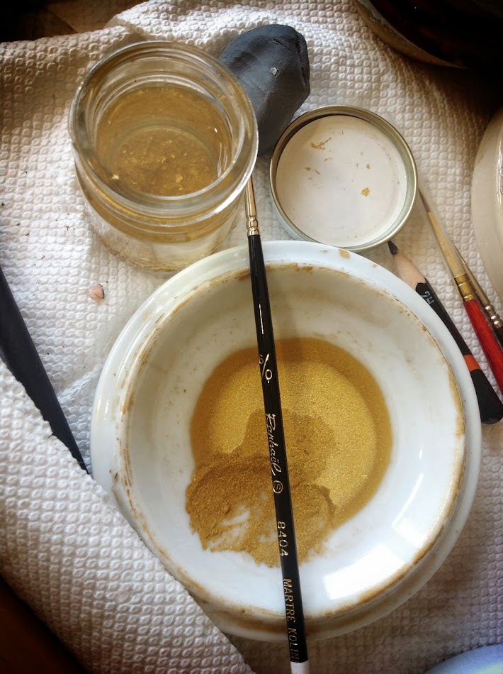
In the picture below you will notice a screw-top glass jar, this is dedicated rinse water for my brush. It allows me to trap any gold from the brush so that it can be re-prepared with my next batch of gold powder, thus not wasting any. For the same reason, when gilding I empty any random scraps into this jar.

Pan / powdered /shell gold for use with a brush or pen.


Sources:
CHOWDRY, Anita. The Alchemy of Pure Gold Pigment. 2011. Anita Chowdry. Web. September 2012. < http://anitachowdry.wordpress.com/2011/05/16/the-alchemy-of-pure-gold-pigment/ >

Author Unknown. The Technique of Shell Gold Painting. Natural Pigments. 2013. Web. July 2013. < http://www.naturalpigments.com/art-supply-education/cat/art-brush-info/post/technique-shell-gold-painting/ >

PORTER, Betsy. Making and Using Shell Gold. Art and Iconography. Web. January 2013. < http://www.betsyporter.com/shell_gold.html >

Monday, September 9, 2013

Diego Miguel Munoz de Castilla (Pelican)

Order of the Pelican
River Wars, Barony of Iron Bog
Awarded September 7, AS 48 (XLVIII)


Peerage scroll for Diego Miguel Munoz de Castilla displaying the Kingdom arms of Ansteorra, Aethelmearc, and the East.

My very first Peerage piece.

At some point after Diego received his Writ, Alys had him look through examples of manuscripts to get a feel for what he might like and of course he fell in love with the Sforza Black Hours she had received when she was made a Tyger of the East. Black Hours he would like, Black Hours he would get.

I've never attempted this style before, however Nataliia had just completed one. We managed to find time to sit down at Pennsic for a couple of hours so that I could pick her brain and play with the materials she had used. It was useful, and she was able to confirm many of the assumptions I'd initially had upon receipt of the assignment. To say I was intimidated is a major understatement.

Sforza Black hours - ÖNB Cod1856 f61
Ms 1856, f.61
All of the Black Hours I've looked at appear to be written in silver with one set of notable exceptions, those contained in the Mira Calligraphiae Monumenta [1] housed in the Getty collection. These pages are usually folios of parchment dyed black during the stretching and scraping process.

Since real silver is likely to tarnish [2] I'm using my W&N silver gouache. The calligraphy is done in this same gouache, watered down so that it flows easily from the nib (Mitchell #5). Writing silver on the black paper wasn't as difficult as I had imagined it would be, although it did take almost twice as long as writing in regular ink. The biggest issue was that I needed to continually mix the gouache [3] and clean my nib every few words so that I could keep a fairly consistent and sharp line for the writing. I also had to use a larger nib than I had wanted since I just couldn't achieve crisp lines with my usual #6 nib. As a by-product the entire piece is larger than I had originally wanted it to be.

This project requires A LOT of gold. The few images I have available to me for the Sforza Hours suggest that most of the gold appears to be painted rather than gilded. For the guide-lines and the written gold words I used my Holbein gold gouache since it works in the same fashion as the silver and was just easier. However for the rest of this piece I wanted a more dramatic luminescence than the gouache offers, so I made my own powdered gold out of the 23k sheets I use for gilding (keep an eye out for a follow up instruction post for this!).

Sforza Black hours - ÖNB Cod1856 f32v - four evangelists
Ms 1856, f.32 verso
My next step was the illustration of the Pelican. I chose to use white gouache as I wasn't sure how much workable paint I would actually need and I just don't have that much lead-white here. My biggest challenge was remembering that when working on a dark ground you're essentially painting in reverse, you're painting the highlights and letting the black ground act as the shadows. I do love how this illustration came out, although I'm not sure I've really managed the correct medieval aesthetic. I would say that mine looks "heavy" by comparison, although this could just be the nature of filling the area with a giant white bird.

Just when I was completely sick of working in white I was finally able to switch to the 23k powdered gold I had created specifically for this piece. To accompany my dish of prepared gold pigment, I also have a small dedicated jar which contains distilled water to collect any scraps from my dedicated gold paintbrush. By doing this I'm always cleaning the dedicated brush in clean water and retaining any fragments during the process, these can then again be prepared for use as gold pigment at a later date.

The gold work actually became as annoying as the white work due to the length of time it ended up taking. It didn't go on nearly as smoothly as I hoped that it would, even though my paint was "wet". In hindsight I wonder if it needed he gold grains to be finer by more grinding.

The silver within the borders was done concurrently with the gold so that I would keep the flow looking consistent.

Next came the colours, all of which went on smoothly and easily. In testing I found that my Cadmium Red gave a much nicer colour than the Spectrum Red that I tend to use more often. My guess is that because the Cadmium Red leans towards orange/yellow it played well against the substantial amount of gold. The Ultramarine blue was cut with a little Permanent White as Nataliia had suggested during out time at Pennsic, it makes for a more vibrant colour than the base tube-colour.

Diego has served over many years in three separate Kingdoms which I was asked to represent on this piece, the roundels within the borders made an ideal location for these; from left to right - Ansteorra, Aethelmearc, and the East. The fourth is Sharc, an East Kingdom household of which Diego is a member. His arms are displayed in the decorated initial D.

Sforza Black hours - ÖNB Cod1856 f32verso-33recto Details:
Calligraphy & Illumination by Isabel Chamberlaine.
Inspired by the Black Hours of Galeazzo Maria Sforza as seen to the right.

Paper: Black 120gsm paper (I forget which brand).
Materials: Holbein "Pearl Gold" and Windsor & Newton "Silver" gouaches for layout lines, calligraphy, and select details. 23k powdered gold in a gum arabic binder for the majority of gold-work. Various W&N gouache for any of the coloured areas.

Text by Alys Mackyntoich
We, Gregor, by right of arms King of the East, and Kiena, his Queen, considering the great, long and earnest travails and labours sustained by Diego Miguel Munoz de Castilla in the service of the art of defence and the safe practices of same for some score of years and more, and after due consideration of the cause above-written and other good and thankful service done by the said Diego to our sister realms of Aethelmearc and Ansteorra, do therefore ordain, approve and confirm the elevation of the said Diego to the Order of the Pelican, and do convey therewith all liberties and privileges attendant thereupon. And we do further by these our present letters give, grant and convey to the said Diego the right to bear arms by letters patent in the following form:  Argent, on a bend sable three escallops palewise argent.  And we do further ratify and approve, for ourselves and our successors, that the gifts and grants made herein shall be in all time coming effectual, good, valid and sufficient perpetually in all and sundry points, and do hereby ordain the same to be put to due execution, and to have full force, strength and effect in all time coming.  Given at Iron Bog upon 7 September in the forty-eight year of the Society.


Footnotes:
[1] This was confirmed during a class I happened to take at Pennsic 2013 that presented findings by the Getty that the black hours contained within the Mira Calligraphiae Monumenta were actually created using a resist technique. Although I need to track down the original source from the Getty, the gist of it was that the calligraphy was written with some sort of resist on white paper, it was then washed over in black ink to create the dark page. The resist is then rubbed away to reveal the calligraphy as the white of the page.

[2] I really do need to test out the tarnishing of real silver on the work we do in the SCA. Just how long does silver-leaf take to tarnish?

[3] Both silver and gold gouache need to be regularly mixed since the metallic pigment has a tendency to settle.

Scroll ID: Isabel C XLII
Completed Sept. 5, 2013

Friday, May 3, 2013

Holbein "Pearl Gold" (G641)

In my post Recommendations for Beginner Scribal Materials, I mentioned Holbein "Pearl Gold" gouache (G641) as being my favourite option for painted gold. I purchased mine through John Neal Booksellers, but I'm sure that it is available elsewhere.

A tube of Holbein "Pearl Gold" (G641) gouache.
In the past I have written the following about this product:

"Through extended use I have found that this modern, water-based paint gives a very similar colour to the 23k gold leaf I commonly use. Originally I found the dried result to appear streaky, however with improved application technique I have achieved a consistent, slightly raised finish.

Experience has taught me that the paint needs to be very wet in the palette-well but only soaking a small amount onto your brush. Make sure to mix the paint often, so as to keep the pigment consistent. When applying to the page it is best to work wet-to-dry by dabbing your freshly loaded brush onto the edge of the most recently painted area, essentially applying wet-to-wet. Once the fresh paint has run off the brush, begin to gently pull the paint towards the dry unpainted areas. You are dragging the paint outwards with the tip rather than painting with the full length of the brush. You want to drag the paint out just enough that you no longer have large watery areas, which will cause the page to crinkle, but not so much that it becomes to thin."

Gilding: Mediums, Mordants & Techniques (Dec 28, 2011)

Monday, April 29, 2013

Recommendations for Beginner Scribal Materials

Does this sound like you...

"Mostly I don't know where to start. I like to look at all of the pretty scrolls but I don't know what basic supplies to get to start trying."

It certainly sounded like me when I first started, and even though I have an art background I had no clue how to get started or what supplies I needed. I spoke with a few people, found a few online scribal communities, joined some email lists, and asked a few questions. There was however a lot of trial and error and although I've gained confidence and skill I still remember those first tentative steps, so here are my recommendations for beginners on the types of tools and materials to equip themselves with.

Firstly, buy the tools and materials that YOUR budget will allow. Also, remember that materials (and by extension your art) end up being very personal, so what one artist loves another one dislikes. These recommendations are just MY opinion, try different tools and materials as your time and budget permit - if you love them, great. If not, then try something else until you find something you do like.

Strathmore 300 Series Bristol Board - In reality it's just thick, multi-medium paper and comes in a smooth  or textured finish. The smoother finishes are much nicer for calligraphy. It can usually be found in local arts and crafts stores, various online stores also carry it. Look for “acid-free” paper to prevent degradation over time. I have both a 9 x 12 and an 11 x 14 pad, one in the "smooth" finish and the other in the "vellum" finish. Both have successfully been used to complete scribal assignments.

Artist Paint Brushes - You'll want to build a selection of small, "round" brushes that have a point. Look for brushes that have at least one "0", preferably multiple "0000" or "3/0" - that's their size. Synthetic hair is fine, and cheaper. "Gold Scepter" is a brand that springs to mind that is readily available in the smallest sizes and perform very well.

Artists Goauche - I am a fan of the Windsor & Newton goauche ("artist" or "designer", rather than "student" grade). However there are other brands, for example I hate the W&N gold but I LOVE the Holbein brand counterpart (Pearl Gold - G641). I will say that if you're going to splurge on anything, gouache should be that thing and as a very general rule, the more expensive the tube the higher the pigment concentration. You can usually buy basic colour sets, or you can buy individual tubes of the colours you need. Try to stick to one manufacturer as much as possible so that the ingredients don’t “fight” over time. When I first started, I just bought individual tubes as I needed them and initially found the following W&N colours to be the most useful - "Ultramarine", "Brilliant Yellow", "Cadmium Red", "Permanent White" and "Jet Black"

Personally I find the "student grade" paints chalky so they end up looking pale or weird on the page. This is a personal gripe I have from my college days though, others may disagree with me.


Pens for Calligraphy - You can usually buy basic calligraphy nibs and holders in sets at the art store. Speedball brand is probably what you will find and they do the job just fine. Each set will have a variety of nib sizes to create different size letters, but make sure at least one of the nibs comes to a fine-point so that you can use it for drawing the lines for your art work.

Ink for Calligraphy - Art stores will usually carry a large selection of inks in various colours. Sometimes, you'll get lucky and find "Iron Gall Ink" or "Oak Gall Ink". If your store carries either of these then buy it and take pride in the fact that you have your first (depending on the recipe and production) period artist material. Iron Gall Ink is my default and I very rarely use anything else because I love the way it flows from my nibs.

Now, I haven't personally seen Iron / Oak Gall Ink sold in any of the stores I've been in (I buy it online), therefore my other beginner recommendation for dip-pens is Sumi black ink. It comes in a bright green, heavy plastic bottle with a black cap and the ink itself has a nice viscosity to it. A word of warning though, it is very corrosive on your nibs if you don't clean them properly. It's very black, and works really well for line-work. You can also find this ink in red (red bottle, black cap).

Pencil - Used for sketching out your artwork and drawing your calligraphy guidelines. When you're at the art store you'll notice that they are graded, "B's" with a higher number being the softest through "HB" which is the middle and then into "H's" which are considered hard. You're looking for a grade that won't damage the surface you'll be working on and that can be erased easily.

Personally I opt for a 2H as it works FOR ME, but choose a grade that will work for the type of pressure you're likely to apply while using it. To hard and it will damage your surface, to soft and you'll have a tougher time while erasing.

Rubber / Eraser - Many scribes swear by those blocky, hard rubbers you probably used in school, just make sure that it's white to avoid potentially marking the page. These can be purchased in a variety of places.

I personally find those hard white rubbers a little weird to use and dislike them. I tend to use what is known as a "putty rubber" or "kneadable eraser" as it works better for me. These are usually found near the pencil selection in the art store.

Straight Edge - You'll need some sort of ruler to mark out your page and draw the lines you'll need for calligraphy. Rulers can be purchased in a variety of materials, lengths and styles. Personally I recommend that you buy one made out of metal as plastic and wooden rulers have the potential of being sliced by your craft knife, thus ruining the straight edge. If you can find one that has a cork backing even better, as this raises the edge off the page a little and helps avoid bleeding or smudging.

Paint Palette - Cheap, multi-well plastic palettes can be found at arts and crafts stores. However, you could also use a dinner plate, ceramic tiles, muscle (or other crustacean) shells, a glass ashtray or any other number of household items you probably already own.


Other Random Supplies - Although you don't NEED any of the following supplies they're useful to have around.
  • Distilled Water - I tend to use this rather than regular tap water to avoid the various additives combined at the treatment plants. One argument is that because it's "purer" it's closer to period water, but who knows if this is true or even really matters.
  • Eye-dropper / Pipette - Found at pharmacies, they end up being very useful for adding very small amounts of water to your paints to thin them.
  • Scalpel / Craft Knife - If you're buying the pads of Bristol paper you probably won't need a craft knife as they're already sized appropriately. However they useful to have around.
  • Cotton Ear-Buds - Yes, the things you clean your ears with. They're actually very useful dipped in rubbing alcohol to clean your calligraphy nibs.
  • Rubbing Alcohol - As mentioned above, rubbing alcohol is great for cleaning your calligraphy nibs.
  • Magnifier - Helps you not strain your eyes! 
  • 100% Talc - Wash your hands, dry them and then coat them in talc. It's stop your hands from sweating while you work.
  • Scrap Paper - Rest your hand on some scrap paper while you work as it will protect the page you're working on from getting greasy and picking up smudges. Hands are dirty!
Useful Links - There are numerous online resources for the things I have mentioned in this post, below are a few of the websites I find useful. Remember to check your local arts and crafts stores as many of these items can be found there.

Tuesday, January 3, 2012

Preparing Pergamenata

NOTE: I will update this post with photo's as soon as I can.

When reading about pergamenata, it's often described as not needing any further surface preparation. However, experience has taught me, that isn't necessarily true and I offer this post to address the problems I have encountered, and the solution that has worked for me.

When painting on the surface, from time to time I would come across what I can only describe as oily spots. Paint would roll back from these areas like it had a mind of its own. Could it be oil transferring from my hand onto the surface, yes. However I also believe that some oils, or surface coatings from the manufacturing process remain and cause the problem areas.
Ingredients for pounce.

After much discussion with various people, both off and online I have found that preparing the surface by roughening it with pounce works wonders. Pounce, for this purpose, is a combination of ground Gum Sandarac and fine Pumice which has been mixed together and contained within a small piece of linen, held together with a rubber band. Both Gum Sandarac and Pumice can be purchased through John Neal Booksellers and a little goes a LONG way.

My process is as follows:
  1. Mix together a small amount of Gum Sandarac and Pumice, maybe a 1/2 teaspoon of each.
  2. Combine the mixture in the middle of a small linen square and secure it closed with a rubber band or other appropriate closure.
  3. With clean dry hands, lightly rub the linen pounce sack, first, up and down, then left to right on your surface area. You are basically trying to gently rub away any residual oils from the surface and raising the nap a little for better "tooth". I usually finish off with large circular motions.
  4. The surface is now covered in pounce dust, gently brush this away with a large, soft brush. I've been told that makeup brushes work wonderfully for this purpose, although I use a 2" artists brush I found at a craft store. If you're feeling frugal you can actually collect this dust for reuse.
  5. DON'T TOUCH YOUR SURFACE WITH BARE HANDS from this point on as you will transfer oils back onto your working area. Instead, cover everywhere except the area you're working on with a barrier. Glassine paper is my preference and can be purchased in rolls from an art store.
  6. Now work as you usually would, drawing your design then applying ink and paint.
Random Notes and Tips:
  • I've found than I tend to wash my hands a lot when working, to keep them clean from oils and random mess. I like to apply 100% talc to my hands every time I wash them.
  • Pounce is also great for cleaning up calligraphy mistakes. After I've scraped away the mistake with my knife I will carefully rub the area with my pounce sack.
  • Occasionally I will discover a small area intended to be painted that I didn't prepare properly, I'll just grab my pounce sack and give that small piece a light rubbing.


Wednesday, December 28, 2011

Gilding: Mediums, Mordants & Techniques

This is an ongoing project as I learn gilding techniques and better comprehend their application. As part of my own experimentation I have used supports that I am likely to use in a real application, 230gm pergamenata and 100lb Strathmore Bristol Vellum. My intent is to also make a similar test page on parchment when I get the chance. I am testing both modern and period mordants and paints.

There are sources detailing how to make period mordants for gilding, most common of which is Cennini’s Il Libro dell' Arte. My intent is to experiment with the various recipes so that I can make my own batches from scratch, however, since I wanted instant gratification I have so far been using mordants purchased from others.


Updated December 2012: Added information regarding my initial use of purchased gesso. 
Updated October 2012: Added initial thoughts on garlic/glair mixture.
Updated August 2012: Added my findings regarding initial tests of an acrylic-based modern gesso.
Updated July 2012: Minor edits.
Updated May 2012: Added early findings regarding the use of a fish-glue / water mixture, and also Kolner Miniatum.
Updated Dec 2011: Added photographs and re-edited body with more up-to-date information.