Order of the Golden Rapier
Great Northeastern War
Awarded July 12, 2014 AS49 (XLIX)
Details:
Calligraphy by Mickel von Salm and illumination by Isabel Chamberlaine. Inspired by the 15th century Sforza Tarot Cards held by the Pierpont Morgan Library MS M.630, no. 23.
This was a collaboration piece between myself and Mickel von Salm, initiated by Carolyne de la Pointe.
Materials: For the illuminated contribution to this piece was Jerry Tresser's Liquid Gesso; 23k gold leaf; 23k shell-gold; Windsor & Newton gouache; homemade sap green.
Words by Lord Michael Arcensis
Scroll ID: Isabel C 46
Completed July 2014
Showing posts with label Misc. Show all posts
Tuesday, August 12, 2014
Wednesday, December 11, 2013
Discussing the Use of Mortar & Pestles
This is a post that I started on Google+ and is embedded here since I consider it a significant discussion on a common tool used by many trades that is probably never given much thought. Please join the discussion in the comments section below.
Monday, December 9, 2013
Guild Mirandola's Oak Gall Ink Kit
Or, Isabel and Aife have a playdate.
At one of the recent SCA events I attended there was an auction and one of the items was a bag full of scribal goodies. Of course I had to have that baggie, but if truth be told I feel a little guilty for paying so little for goods worth A LOT more. One of the items in the baggie was an Oak Gall Ink Kit from Guild Mirandola, a small scribal supplies vendor here in the East Kingdom.
Aife needed ink for something she's working on, and I just happened to have the supplies available. What follows isn't my own work, it's what happened when we followed the instructions included in the Kit. I'm not going to specifically detail the instructions and ingredients here as I feel that would be unfair to Guild Mirandola (Doscelina's contact information can be found on the website). The Kit contains very easy to follow instructions and I strongly recommend that people buy the Kit. This is period-style ink making made so simple that ANYONE can do it.
Although the Oak Gall Ink Kit contains exactly the about of ingredients you need, we actually ended up making double what was specified because I had my own supplies already but had never actually gotten around to using them. Other items needed are easy to lay your hands on and should be readily available to most people.
At one of the recent SCA events I attended there was an auction and one of the items was a bag full of scribal goodies. Of course I had to have that baggie, but if truth be told I feel a little guilty for paying so little for goods worth A LOT more. One of the items in the baggie was an Oak Gall Ink Kit from Guild Mirandola, a small scribal supplies vendor here in the East Kingdom.
Aife needed ink for something she's working on, and I just happened to have the supplies available. What follows isn't my own work, it's what happened when we followed the instructions included in the Kit. I'm not going to specifically detail the instructions and ingredients here as I feel that would be unfair to Guild Mirandola (Doscelina's contact information can be found on the website). The Kit contains very easy to follow instructions and I strongly recommend that people buy the Kit. This is period-style ink making made so simple that ANYONE can do it.
Although the Oak Gall Ink Kit contains exactly the about of ingredients you need, we actually ended up making double what was specified because I had my own supplies already but had never actually gotten around to using them. Other items needed are easy to lay your hands on and should be readily available to most people.
| Crushed gall nuts in the mortar. |
First order of business was to set up the gum arabic crystals to dissolve while we followed the rest of the instructions. Once that was set up we needed to crush the gall nuts. They were shoved into a plastic ziplock bag, that was then wrapped in a kitchen towel and then smashed vigorously with a hammer borrowed from my "shop gnome". Once they'd been reduce to much smaller pieces they were transferred to the mortar and pestle and ground into "a fine powder".
I do want to comment on how annoying these were to grind, they proved to be much tougher than I had imagined. They are surprisingly hard and I actually ended up with a blister in the center of my hand from the grinding. Get around this by getting them as broken and small as you possibly can with the hammer. The smaller they are before they hit the mortar and pestle, the less hand grinding you'll need to do.
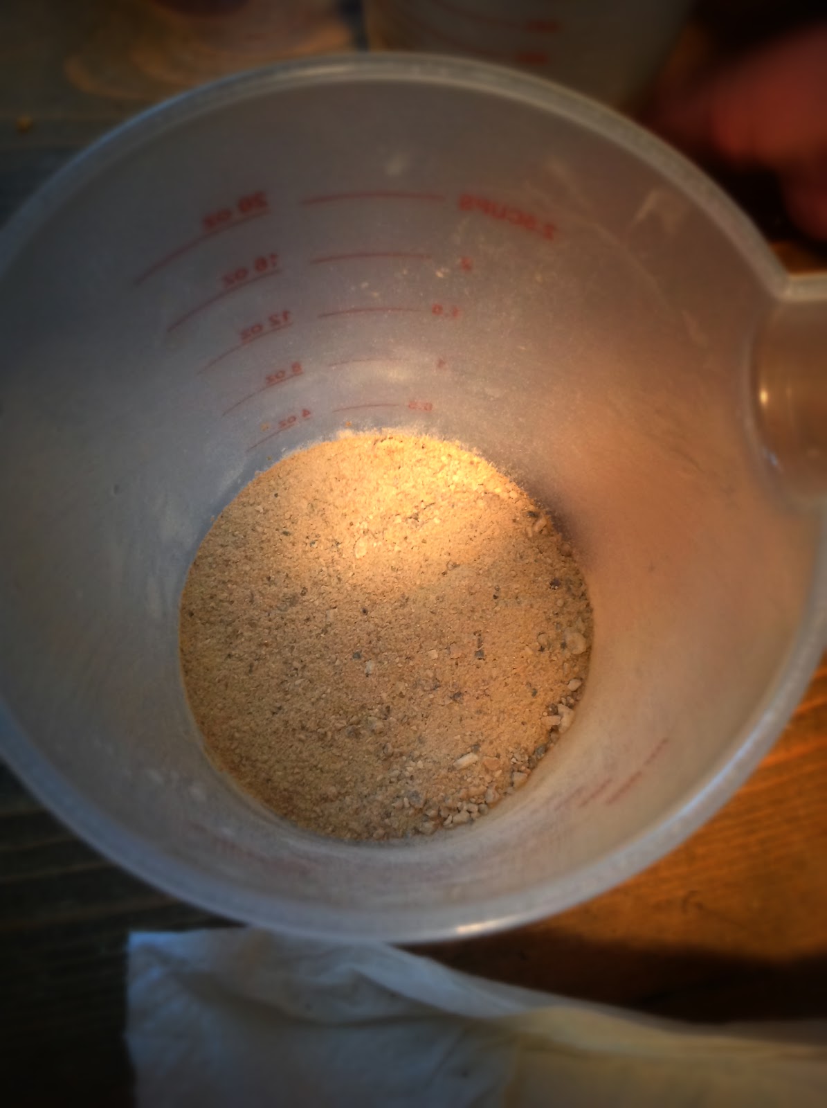
You'll end up with this...
| Gall nuts reduced to "fine powder" |
Continuing to following the instructions, add the water and let it sit. So just how patient are you? We were working on a couple of other projects at the same time, so our little container of brown gunk actually ended up marinating for well over an hour. It has a VERY earthy smell which I surprisingly found quite pleasant.
Back to following the instructions that came with the kit and we find that it's time to add the green ferrous sulfate. The instructions say that when you add this to the brown gunk it will start to turn black immediately, and it did! We both stood there, staring into the jug saying "that's SO COOL!". We then stirred vigorously so that everything was thoroughly mixed.
Next step was to filter the mixture through some linen to remove all the nasty gunky bits. We used a piece of natural coloured linen which we first saturated with water to help the process along.
We ended up with about a half of a pint-sized Mason jar of black liquid, basically a dye, and to this was added the gum arabic which we had been dissolving. The addition of the gum arabic provides the binder (glue) that turns the dye into an ink, making it stick to a page.
Upon testing, we found that we had achieved a nice writable ink in a viscosity that I liked. I will admit to being a little surprised at how black it was straight out of the jar, I was expecting it to initially write quite faint (it darkens over time) and be almost translucent but it wasn't.
A word on dissolving the gun arabic crystals. We found that keeping the solution warm helped the crystals dissolve at a much better rate. We had allowed the water to cool while we worked on other things, it really delayed the process and the crystals stuck to our stir-stick.
Back to following the instructions that came with the kit and we find that it's time to add the green ferrous sulfate. The instructions say that when you add this to the brown gunk it will start to turn black immediately, and it did! We both stood there, staring into the jug saying "that's SO COOL!". We then stirred vigorously so that everything was thoroughly mixed.
| Oak gall "tea" after the ferrous sulfate has been added. |
| Oak gall ink mixture being filtered through linen to remove the debris. |
Upon testing, we found that we had achieved a nice writable ink in a viscosity that I liked. I will admit to being a little surprised at how black it was straight out of the jar, I was expecting it to initially write quite faint (it darkens over time) and be almost translucent but it wasn't.
| Very rough draft writing with the ink made from the Guild Mirandola Oak Gall Ink Kit. |
A word on dissolving the gun arabic crystals. We found that keeping the solution warm helped the crystals dissolve at a much better rate. We had allowed the water to cool while we worked on other things, it really delayed the process and the crystals stuck to our stir-stick.
For detailed instructions and supplies please purchase one of these
Oak Gall Ink Kits from Guild Mirandola.
Thursday, December 5, 2013
How to Care for Your Metal Dip Pen Nibs
Most modern calligraphy nibs are made of metal, and like most things they need a little tender loving care to keep them in good condition. Inks not only have the potential to clog your nibs as they dry, but some inks are actually corrosive and damage them.
Disclaimer: This is MY way of doing things and works FOR ME, others may do things differently. There is not "one true way", so find what works for you.
Cleaning:
There are commercial nib cleaning solutions available for purchase, however I've never used one as I don't really see the point. I consider my nibs disposable items and I fully expect them to deteriorate over time, needing to be replaced. That's not to say that I don't try to keep them in good condition, so here are my tips for cleaning metal nibs.
After use I either swish my nib in the rinse-water jar I've been using or use a pipette to squirt water over the nib, but I'm not overly concerned with getting all the ink off the nib. Afterwards I take the nib out of the pen holder so that it can be fully cleaned and dried. My next step is to take a Q-tip and dip one of the ends into rubbing alcohol (both can be purchased in any pharmacy or supermarket), then I use that wet end to thoroughly clean the nib surface. Using a Q-tip allows you to get into all the nooks and crannies on the nib, and the beauty of rubbing alcohol is that it dries VERY quickly through evaporation, leaving the nib mostly dry and reducing the potential to rust. Dried on ink will need more pressure than "fresh" ink, but be careful not to bend the nib ends.Once I've gotten off as much of the ink as I can I just let the nib and pen holder sit on some paper towel for a while so that they can dry further before I store them away.
Some nibs have attached reservoirs on them, especially if you're using the Speedball brand nibs that come in the variety packs at the local art/craft stores. These can be a little annoying when trying to clean your nibs as the reservoir creates a space where ink can get trapped, allowing it to dry and gunk up the nib. Personally I've found these reservoirs more trouble than they are worth as I find that not only are they difficult to clean but, for me, they also load to much ink on to the pen when writing. I've ripped the reservoirs off when ever they've been attached to a nib that I use. This is where the pipette comes in handy, use it to flush the rubbing alcohol under the reservoir. Another option is to try to side some paper towel between the nib and reservoir, be careful as you do this though as you don't want to pull the reservoir to far off the surface of the nib.
Nib Tune-Up:
You will need a whetstone, I bought mine from John Neal Booksellers - Hard Arkansas Stone.
My first step is to put a drop or two of water on the end of the whetstone and just rub it into the stone a little, I'm not 100% sure if it's actually needed but all the things I've seen and read tell you to moisten the stone with either oil[1] or water.
Step 1: Next place the very tip of the nib on the whetstone so that it perpendicular to the stone. You are now going to stroke the nib back and forth (sideways) a few times on the whetstone to achieve a straight tip. It's VERY IMPORTANT that you make this motion from your shoulder and NOT your wrist. Moving from the wrist will twist the movement and has the potential to round the edges of the nib, by moving from the shoulder this is less likely to happen.
Step 3: At this point I I lay the back of the nib against the edge of the whetstone and then angle it up a little, using the same back and forth motion to remove any burrs from the back.
If you look closely (use a magnifier if you like) you will see bright clean metal around the areas the nib has brushed against the whetstone.
It's important to remember that although you're "sharpening" you nib, you don't want it so sharp that it actually cuts the surface (paper, parchment, etc.) you'll be writing on. Once you've tuned-up your nib try writing with it, if it's catching on the surface you can dull the very tip a little by going back and repeating step one with a couple of strokes.
My habit is to tune-up my nib at the beginning of my scribal session. On occasion, if the piece I am writing is really long, I will need to pause part way through to give another quick tune-up. Once you've done this a time or two, you'll get a feel for how much or how little you need to tune-up your nibs. It's not difficult to do and it will not only prolong the life of your nibs a little but also help the nib move a little easier across the page.
Footnotes:
[1] Don't use oil on the stone your using with your nibs as you don't want that transferring to your finished page.
Sources & Bibliography:
Class taught by Eva Woderose at Known World Herald & Scribes Symposium in CT, 2012.
Other various sources of which I don't remember.
BROWN, Michelle P. & Patricia Lovett. The Historical Source Book for Scribes. London: The British Library, 1999. Print. ISBN 0-8020-4720-3
Disclaimer: This is MY way of doing things and works FOR ME, others may do things differently. There is not "one true way", so find what works for you.
Cleaning:
There are commercial nib cleaning solutions available for purchase, however I've never used one as I don't really see the point. I consider my nibs disposable items and I fully expect them to deteriorate over time, needing to be replaced. That's not to say that I don't try to keep them in good condition, so here are my tips for cleaning metal nibs.
After use I either swish my nib in the rinse-water jar I've been using or use a pipette to squirt water over the nib, but I'm not overly concerned with getting all the ink off the nib. Afterwards I take the nib out of the pen holder so that it can be fully cleaned and dried. My next step is to take a Q-tip and dip one of the ends into rubbing alcohol (both can be purchased in any pharmacy or supermarket), then I use that wet end to thoroughly clean the nib surface. Using a Q-tip allows you to get into all the nooks and crannies on the nib, and the beauty of rubbing alcohol is that it dries VERY quickly through evaporation, leaving the nib mostly dry and reducing the potential to rust. Dried on ink will need more pressure than "fresh" ink, but be careful not to bend the nib ends.Once I've gotten off as much of the ink as I can I just let the nib and pen holder sit on some paper towel for a while so that they can dry further before I store them away.
Some nibs have attached reservoirs on them, especially if you're using the Speedball brand nibs that come in the variety packs at the local art/craft stores. These can be a little annoying when trying to clean your nibs as the reservoir creates a space where ink can get trapped, allowing it to dry and gunk up the nib. Personally I've found these reservoirs more trouble than they are worth as I find that not only are they difficult to clean but, for me, they also load to much ink on to the pen when writing. I've ripped the reservoirs off when ever they've been attached to a nib that I use. This is where the pipette comes in handy, use it to flush the rubbing alcohol under the reservoir. Another option is to try to side some paper towel between the nib and reservoir, be careful as you do this though as you don't want to pull the reservoir to far off the surface of the nib.
Nib Tune-Up:
You will need a whetstone, I bought mine from John Neal Booksellers - Hard Arkansas Stone.
My first step is to put a drop or two of water on the end of the whetstone and just rub it into the stone a little, I'm not 100% sure if it's actually needed but all the things I've seen and read tell you to moisten the stone with either oil[1] or water.
| Step 1: Sharpen the very tip of the nib. |
| Step 2: Smooth the edges of the nib of any burrs. |
Step 2: I will then turn the nib so that the side of the nib is resting on the edge of the whetstone. Again, moving from the shoulder, stroke back and forth a few times to remove any burrs. Repeat this for the second edge.
| Step 3: Smooth the back of the nib at a very slight angle. |
| Step 4: Sharpen the front of the nib. |
Step 4: The last step with the whetstone sees me working the front of the nib. Lay the nib on the stone and then angle it up to about a 30% angle, use the back and forth motion a few times.
If you look closely (use a magnifier if you like) you will see bright clean metal around the areas the nib has brushed against the whetstone.
My very last step is to run the edges over the leather whetstone sleeve to soften them off a little.
It's important to remember that although you're "sharpening" you nib, you don't want it so sharp that it actually cuts the surface (paper, parchment, etc.) you'll be writing on. Once you've tuned-up your nib try writing with it, if it's catching on the surface you can dull the very tip a little by going back and repeating step one with a couple of strokes.
My habit is to tune-up my nib at the beginning of my scribal session. On occasion, if the piece I am writing is really long, I will need to pause part way through to give another quick tune-up. Once you've done this a time or two, you'll get a feel for how much or how little you need to tune-up your nibs. It's not difficult to do and it will not only prolong the life of your nibs a little but also help the nib move a little easier across the page.
Footnotes:
[1] Don't use oil on the stone your using with your nibs as you don't want that transferring to your finished page.
Sources & Bibliography:
Class taught by Eva Woderose at Known World Herald & Scribes Symposium in CT, 2012.
Other various sources of which I don't remember.
BROWN, Michelle P. & Patricia Lovett. The Historical Source Book for Scribes. London: The British Library, 1999. Print. ISBN 0-8020-4720-3
Thursday, November 21, 2013
Verdigris Epic Fail
About a week ago I remembered that I'd forgotten all about the crock of verdigris I had "brewing" in the garden. We've had some pretty depressing weather since I sealed the jar with wax and set it aside. Granted, it was an extension of my Not-Even-Trying-To-Be-Period Verdigris which had been a success, but unfortunately this time it was an epic failure.
I knew immediately that this was a bust, however I figured that I could at least see what I would get if I drained it through a coffee filter.
The answer, not much. Just a disgusting combination of sediment, teal-colouring, wax and soggy dead bugs. Definitely nothing useable.
I threw it all in the rubbish with plans to start over.
The good news it that for my next foray into making verdigris I have purchased organic vinegar's (unfiltered apple cider with "the Mother" and a white wine vinegar) which attempts to get me a small step closer to what would have been available in period. I've also been donated some homemade wines so that I can attempt to create my own vinegar.
Experiments are pending.
This is what I bought inside, a frozen block of teal-coloured water. The wax I'd used to seal the jar had melted and/or disintegrated at some point and the remnants were trapped in the ice, you can even see some on top. I set it aside for a few days so that the ice had time to melt and I could find time to clean up my mess.
![]() |
| Failed verdigris experiment. A frozen mass of copper acetate, copper piping, vinegar, wax and water. |
The answer, not much. Just a disgusting combination of sediment, teal-colouring, wax and soggy dead bugs. Definitely nothing useable.
![]() |
| Remnants of the copper-water, a combination of sediment, teal-colouring, wax and soggy dead bugs. |
The good news it that for my next foray into making verdigris I have purchased organic vinegar's (unfiltered apple cider with "the Mother" and a white wine vinegar) which attempts to get me a small step closer to what would have been available in period. I've also been donated some homemade wines so that I can attempt to create my own vinegar.
Experiments are pending.
Wednesday, October 16, 2013
The Making of a Gold Pigment for the Black Hours Scroll
Recently I created a Peerage piece based on the Sforza Black Hours, which required the use of a lot of gold. When inspecting the original I came to the conclusion that the gold (and silver) were most likely applied with a brush or quill, as opposed to having been gilded.
I needed powdered gold to use as paint, and I needed a lot of it. This is how I made it.
A number of the period manuals describe the making of powdered (sometimes called pan or shell) gold by grinding it in a mortar with salt and honey, somewhat surprisingly I decided not to use that method for my own uses. I'm not entirely certain why. Instead I went with a method that I have read about on various websites pertaining to Orthodox iconography painting.
Most of the time I use gum arabic in dry powder form, just adding a little to my dry pigment as I begin the grinding process. For this method of making pan gold I needed a liquid, so my first step was to make a high-ratio gum Arabic solution.
Firstly, gather supplies - distilled water, gum arabic powder, a measuring cup, a saucepan, a cup (or bowl if you prefer), and a stirring device.
Fill the saucepan with regular tap water and place into this the cup/bowl, essentially creating a double-boiler. Measure out a quantity of the distilled water, in this case I measured out a 1/2-cup, and pour it into the cup/bowl. Turn on the stove and bring the water in the saucepan to a boil, which will in turn gently heat the water in the cup/bowl.
While this is happening, measure out the same quantity of gum arabic powder (1/2-cup). Once the distilled water is warm, start adding the powder one spoon at a time and mix well to dissolve. Eventually the top will get frothy and it will thicken to the consistency of honey.
After a couple of days the powder will have dissolved further and have turned a clearer amber colour, like honey. Mine still has what looks like froth on the surface, I'm assuming that this might be undissolved powder but I'm not completely sure.
The next thing you want to do will be to strain it through a cloth to prevent any particulates being in your finished solution. I cut up a pair of stockings (art before beauty!) to use as a filter for this and let the solution drain into a Mason jar.
A quick search of the internet bought me to the following instructions:
"To prepare the gum arabic-water solution you will need approximately one part of water to an equal amount in volume of gum arabic. The actual proportions here is not critical, but what is vital is that the consistency of the gum-water solution should be like thick honey. In a double boiler, heat the water and stir in the gum arabic. Powdered gum takes less time to dissolve then lumps, but complete dissolution still requires about two to three days. After the solution cools, cover and leave it until the solution is clear and the gum completely dissolved. Strain the gum solution through cheesecloth into a clean jar. Keep refrigerated when not in use for it spoils easily. Never heat this solution over a direct flame or heating element, for it will scorch."
Unfortunately I didn't make a note of the source (if anyone knows the source please let me know so that I can give due credit), but following these instructions I set about making my own.
| Supplies for making a high-ratio gum arabic solution. |
Fill the saucepan with regular tap water and place into this the cup/bowl, essentially creating a double-boiler. Measure out a quantity of the distilled water, in this case I measured out a 1/2-cup, and pour it into the cup/bowl. Turn on the stove and bring the water in the saucepan to a boil, which will in turn gently heat the water in the cup/bowl.
| Dissolving powdered gum arabic using a double-boiler method. |
Once you're happy with the consistency, pull the cup/bowl from the saucepan, cover (I used a small plastic sandwich bag) and set aside to cool down. At this point it looks very creamy-white. Once it's completely cool, place it in the fridge.
| Straining gum arabicsolution through a cloth to remove any parti |
Grinding the Gold into Pigment
Before you begin, find a comfortable spot to sit with a solid surface in front of you. Next cue up a movie to watch to keep you occupied while you do this because it is BORING...
You will need a shallow dish of some sort. I have a set of porcelain dishes I got from an art supply store, in reality you could just use a saucer from the cupboard (ProTip: Goodwill is a fantastic place to shop for such things).
Before you begin, find a comfortable spot to sit with a solid surface in front of you. Next cue up a movie to watch to keep you occupied while you do this because it is BORING...
You will need a shallow dish of some sort. I have a set of porcelain dishes I got from an art supply store, in reality you could just use a saucer from the cupboard (ProTip: Goodwill is a fantastic place to shop for such things).
First, add a glob of the gum arabic solution to the clean dish, about the size of a US Quarter (25c). Onto this place a leaf of gold, the same as you would use for gilding (in my case 23k gold from John Neal Bookseller). With the pad of your index or middle finger tap down on the gold a few times until it disintegrates into the gum solution. Add another sheet of gold leaf and repeat the above process until you've used about 10 sheets. You may find that you have to add a little more gum arabic solution if things get to dry.
You should have something that looks a little like the picture to the left. Now, add a couple of drops of distilled water to moisten it a little. You're now going to sit there for an hour or so, grinding the gold solution with your finger-pad.
The dish of gold will start to look like this. Continue rubbing (grinding) the gold particles to make them as small as possible. Once you feel that you been grinding for long enough, do it some more.
Finally, add enough distilled water to your dish so that it covers the gold and creates a small lake. Swirl the water around just a little, "washing" the gold, not to much though as you don't want to remove to much of the gum arabic, then let it sit. Preferably covered, and preferably overnight. By doing this you're allowing the gold particles to completely settle on the bottom of the dish since they are heavier than the water. The water will appear clear. Use an eyedropper (available from a local pharmacy) to carefully remove as much of the water as you can, you won't get all of it. Let the remaining water evaporate.
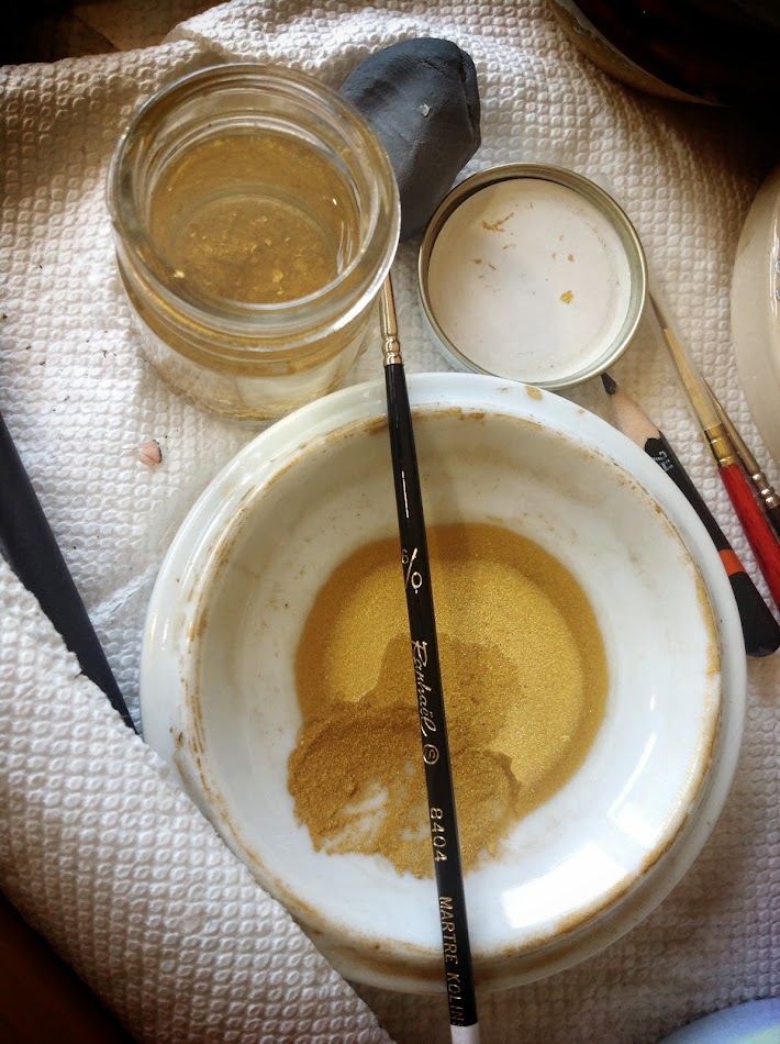
Congratulations, you now have a gold paint that you can use with a brush, pen or quill. Reconstitute with a little water and use in a similar manner to gouache or watercolour. I found that it has a fairly "gritty" consistency and I'm currently unsure if this is what you get since it's a metal or if I just didn't grind the particles small enough during preparation.
In the picture below you will notice a screw-top glass jar, this is dedicated rinse water for my brush. It allows me to trap any gold from the brush so that it can be re-prepared with my next batch of gold powder, thus not wasting any. For the same reason, when gilding I empty any random scraps into this jar.
Sources:
CHOWDRY, Anita. The Alchemy of Pure Gold Pigment. 2011. Anita Chowdry. Web. September 2012. < http://anitachowdry.wordpress.com/2011/05/16/the-alchemy-of-pure-gold-pigment/ >
You should have something that looks a little like the picture to the left. Now, add a couple of drops of distilled water to moisten it a little. You're now going to sit there for an hour or so, grinding the gold solution with your finger-pad.
The dish of gold will start to look like this. Continue rubbing (grinding) the gold particles to make them as small as possible. Once you feel that you been grinding for long enough, do it some more.
Finally, add enough distilled water to your dish so that it covers the gold and creates a small lake. Swirl the water around just a little, "washing" the gold, not to much though as you don't want to remove to much of the gum arabic, then let it sit. Preferably covered, and preferably overnight. By doing this you're allowing the gold particles to completely settle on the bottom of the dish since they are heavier than the water. The water will appear clear. Use an eyedropper (available from a local pharmacy) to carefully remove as much of the water as you can, you won't get all of it. Let the remaining water evaporate.
Congratulations, you now have a gold paint that you can use with a brush, pen or quill. Reconstitute with a little water and use in a similar manner to gouache or watercolour. I found that it has a fairly "gritty" consistency and I'm currently unsure if this is what you get since it's a metal or if I just didn't grind the particles small enough during preparation.
In the picture below you will notice a screw-top glass jar, this is dedicated rinse water for my brush. It allows me to trap any gold from the brush so that it can be re-prepared with my next batch of gold powder, thus not wasting any. For the same reason, when gilding I empty any random scraps into this jar.
| Pan / powdered /shell gold for use with a brush or pen. |
Sources:
CHOWDRY, Anita. The Alchemy of Pure Gold Pigment. 2011. Anita Chowdry. Web. September 2012. < http://anitachowdry.wordpress.com/2011/05/16/the-alchemy-of-pure-gold-pigment/ >
Author Unknown. The Technique of Shell Gold Painting. Natural Pigments. 2013. Web. July 2013. < http://www.naturalpigments.com/art-supply-education/cat/art-brush-info/post/technique-shell-gold-painting/ >
PORTER, Betsy. Making and Using Shell Gold. Art and Iconography. Web. January 2013. < http://www.betsyporter.com/shell_gold.html >
Saturday, May 4, 2013
Black Sumi Ink
![]() |
| Black Sumi Ink purchased at my local at store. |
Friday, May 3, 2013
Holbein "Pearl Gold" (G641)
In my post Recommendations for Beginner Scribal Materials, I mentioned Holbein "Pearl Gold" gouache (G641) as being my favourite option for painted gold. I purchased mine through John Neal Booksellers, but I'm sure that it is available elsewhere.
In the past I have written the following about this product:
"Through extended use I have found that this modern, water-based paint gives a very similar colour to the 23k gold leaf I commonly use. Originally I found the dried result to appear streaky, however with improved application technique I have achieved a consistent, slightly raised finish.
Experience has taught me that the paint needs to be very wet in the palette-well but only soaking a small amount onto your brush. Make sure to mix the paint often, so as to keep the pigment consistent. When applying to the page it is best to work wet-to-dry by dabbing your freshly loaded brush onto the edge of the most recently painted area, essentially applying wet-to-wet. Once the fresh paint has run off the brush, begin to gently pull the paint towards the dry unpainted areas. You are dragging the paint outwards with the tip rather than painting with the full length of the brush. You want to drag the paint out just enough that you no longer have large watery areas, which will cause the page to crinkle, but not so much that it becomes to thin."
Gilding: Mediums, Mordants & Techniques (Dec 28, 2011)
![]() |
| A tube of Holbein "Pearl Gold" (G641) gouache. |
"Through extended use I have found that this modern, water-based paint gives a very similar colour to the 23k gold leaf I commonly use. Originally I found the dried result to appear streaky, however with improved application technique I have achieved a consistent, slightly raised finish.
Experience has taught me that the paint needs to be very wet in the palette-well but only soaking a small amount onto your brush. Make sure to mix the paint often, so as to keep the pigment consistent. When applying to the page it is best to work wet-to-dry by dabbing your freshly loaded brush onto the edge of the most recently painted area, essentially applying wet-to-wet. Once the fresh paint has run off the brush, begin to gently pull the paint towards the dry unpainted areas. You are dragging the paint outwards with the tip rather than painting with the full length of the brush. You want to drag the paint out just enough that you no longer have large watery areas, which will cause the page to crinkle, but not so much that it becomes to thin."
Gilding: Mediums, Mordants & Techniques (Dec 28, 2011)
Monday, April 29, 2013
Recommendations for Beginner Scribal Materials
Does this sound like you...
It certainly sounded like me when I first started, and even though I have an art background I had no clue how to get started or what supplies I needed. I spoke with a few people, found a few online scribal communities, joined some email lists, and asked a few questions. There was however a lot of trial and error and although I've gained confidence and skill I still remember those first tentative steps, so here are my recommendations for beginners on the types of tools and materials to equip themselves with.
Firstly, buy the tools and materials that YOUR budget will allow. Also, remember that materials (and by extension your art) end up being very personal, so what one artist loves another one dislikes. These recommendations are just MY opinion, try different tools and materials as your time and budget permit - if you love them, great. If not, then try something else until you find something you do like.
Strathmore 300 Series Bristol Board - In reality it's just thick, multi-medium paper and comes in a smooth or textured finish. The smoother finishes are much nicer for calligraphy. It can usually be found in local arts and crafts stores, various online stores also carry it. Look for “acid-free” paper to prevent degradation over time. I have both a 9 x 12 and an 11 x 14 pad, one in the "smooth" finish and the other in the "vellum" finish. Both have successfully been used to complete scribal assignments.
Artist Paint Brushes - You'll want to build a selection of small, "round" brushes that have a point. Look for brushes that have at least one "0", preferably multiple "0000" or "3/0" - that's their size. Synthetic hair is fine, and cheaper. "Gold Scepter" is a brand that springs to mind that is readily available in the smallest sizes and perform very well.
Artists Goauche - I am a fan of the Windsor & Newton goauche ("artist" or "designer", rather than "student" grade). However there are other brands, for example I hate the W&N gold but I LOVE the Holbein brand counterpart (Pearl Gold - G641). I will say that if you're going to splurge on anything, gouache should be that thing and as a very general rule, the more expensive the tube the higher the pigment concentration. You can usually buy basic colour sets, or you can buy individual tubes of the colours you need. Try to stick to one manufacturer as much as possible so that the ingredients don’t “fight” over time. When I first started, I just bought individual tubes as I needed them and initially found the following W&N colours to be the most useful - "Ultramarine", "Brilliant Yellow", "Cadmium Red", "Permanent White" and "Jet Black"
Personally I find the "student grade" paints chalky so they end up looking pale or weird on the page. This is a personal gripe I have from my college days though, others may disagree with me.
Pens for Calligraphy - You can usually buy basic calligraphy nibs and holders in sets at the art store. Speedball brand is probably what you will find and they do the job just fine. Each set will have a variety of nib sizes to create different size letters, but make sure at least one of the nibs comes to a fine-point so that you can use it for drawing the lines for your art work.
Ink for Calligraphy - Art stores will usually carry a large selection of inks in various colours. Sometimes, you'll get lucky and find "Iron Gall Ink" or "Oak Gall Ink". If your store carries either of these then buy it and take pride in the fact that you have your first (depending on the recipe and production) period artist material. Iron Gall Ink is my default and I very rarely use anything else because I love the way it flows from my nibs.
Now, I haven't personally seen Iron / Oak Gall Ink sold in any of the stores I've been in (I buy it online), therefore my other beginner recommendation for dip-pens is Sumi black ink. It comes in a bright green, heavy plastic bottle with a black cap and the ink itself has a nice viscosity to it. A word of warning though, it is very corrosive on your nibs if you don't clean them properly. It's very black, and works really well for line-work. You can also find this ink in red (red bottle, black cap).
Pencil - Used for sketching out your artwork and drawing your calligraphy guidelines. When you're at the art store you'll notice that they are graded, "B's" with a higher number being the softest through "HB" which is the middle and then into "H's" which are considered hard. You're looking for a grade that won't damage the surface you'll be working on and that can be erased easily.
Personally I opt for a 2H as it works FOR ME, but choose a grade that will work for the type of pressure you're likely to apply while using it. To hard and it will damage your surface, to soft and you'll have a tougher time while erasing.
Rubber / Eraser - Many scribes swear by those blocky, hard rubbers you probably used in school, just make sure that it's white to avoid potentially marking the page. These can be purchased in a variety of places.
I personally find those hard white rubbers a little weird to use and dislike them. I tend to use what is known as a "putty rubber" or "kneadable eraser" as it works better for me. These are usually found near the pencil selection in the art store.
Straight Edge - You'll need some sort of ruler to mark out your page and draw the lines you'll need for calligraphy. Rulers can be purchased in a variety of materials, lengths and styles. Personally I recommend that you buy one made out of metal as plastic and wooden rulers have the potential of being sliced by your craft knife, thus ruining the straight edge. If you can find one that has a cork backing even better, as this raises the edge off the page a little and helps avoid bleeding or smudging.
Paint Palette - Cheap, multi-well plastic palettes can be found at arts and crafts stores. However, you could also use a dinner plate, ceramic tiles, muscle (or other crustacean) shells, a glass ashtray or any other number of household items you probably already own.
Other Random Supplies - Although you don't NEED any of the following supplies they're useful to have around.
"Mostly I don't know where to start. I like to look at all of the pretty scrolls but I don't know what basic supplies to get to start trying."
It certainly sounded like me when I first started, and even though I have an art background I had no clue how to get started or what supplies I needed. I spoke with a few people, found a few online scribal communities, joined some email lists, and asked a few questions. There was however a lot of trial and error and although I've gained confidence and skill I still remember those first tentative steps, so here are my recommendations for beginners on the types of tools and materials to equip themselves with.
Strathmore 300 Series Bristol Board - In reality it's just thick, multi-medium paper and comes in a smooth or textured finish. The smoother finishes are much nicer for calligraphy. It can usually be found in local arts and crafts stores, various online stores also carry it. Look for “acid-free” paper to prevent degradation over time. I have both a 9 x 12 and an 11 x 14 pad, one in the "smooth" finish and the other in the "vellum" finish. Both have successfully been used to complete scribal assignments.
Artist Paint Brushes - You'll want to build a selection of small, "round" brushes that have a point. Look for brushes that have at least one "0", preferably multiple "0000" or "3/0" - that's their size. Synthetic hair is fine, and cheaper. "Gold Scepter" is a brand that springs to mind that is readily available in the smallest sizes and perform very well.
Artists Goauche - I am a fan of the Windsor & Newton goauche ("artist" or "designer", rather than "student" grade). However there are other brands, for example I hate the W&N gold but I LOVE the Holbein brand counterpart (Pearl Gold - G641). I will say that if you're going to splurge on anything, gouache should be that thing and as a very general rule, the more expensive the tube the higher the pigment concentration. You can usually buy basic colour sets, or you can buy individual tubes of the colours you need. Try to stick to one manufacturer as much as possible so that the ingredients don’t “fight” over time. When I first started, I just bought individual tubes as I needed them and initially found the following W&N colours to be the most useful - "Ultramarine", "Brilliant Yellow", "Cadmium Red", "Permanent White" and "Jet Black"
Personally I find the "student grade" paints chalky so they end up looking pale or weird on the page. This is a personal gripe I have from my college days though, others may disagree with me.
Pens for Calligraphy - You can usually buy basic calligraphy nibs and holders in sets at the art store. Speedball brand is probably what you will find and they do the job just fine. Each set will have a variety of nib sizes to create different size letters, but make sure at least one of the nibs comes to a fine-point so that you can use it for drawing the lines for your art work.
Now, I haven't personally seen Iron / Oak Gall Ink sold in any of the stores I've been in (I buy it online), therefore my other beginner recommendation for dip-pens is Sumi black ink. It comes in a bright green, heavy plastic bottle with a black cap and the ink itself has a nice viscosity to it. A word of warning though, it is very corrosive on your nibs if you don't clean them properly. It's very black, and works really well for line-work. You can also find this ink in red (red bottle, black cap).
Personally I opt for a 2H as it works FOR ME, but choose a grade that will work for the type of pressure you're likely to apply while using it. To hard and it will damage your surface, to soft and you'll have a tougher time while erasing.
Rubber / Eraser - Many scribes swear by those blocky, hard rubbers you probably used in school, just make sure that it's white to avoid potentially marking the page. These can be purchased in a variety of places.
I personally find those hard white rubbers a little weird to use and dislike them. I tend to use what is known as a "putty rubber" or "kneadable eraser" as it works better for me. These are usually found near the pencil selection in the art store.
Straight Edge - You'll need some sort of ruler to mark out your page and draw the lines you'll need for calligraphy. Rulers can be purchased in a variety of materials, lengths and styles. Personally I recommend that you buy one made out of metal as plastic and wooden rulers have the potential of being sliced by your craft knife, thus ruining the straight edge. If you can find one that has a cork backing even better, as this raises the edge off the page a little and helps avoid bleeding or smudging.
Paint Palette - Cheap, multi-well plastic palettes can be found at arts and crafts stores. However, you could also use a dinner plate, ceramic tiles, muscle (or other crustacean) shells, a glass ashtray or any other number of household items you probably already own.
Other Random Supplies - Although you don't NEED any of the following supplies they're useful to have around.
- Distilled Water - I tend to use this rather than regular tap water to avoid the various additives combined at the treatment plants. One argument is that because it's "purer" it's closer to period water, but who knows if this is true or even really matters.
- Eye-dropper / Pipette - Found at pharmacies, they end up being very useful for adding very small amounts of water to your paints to thin them.
- Scalpel / Craft Knife - If you're buying the pads of Bristol paper you probably won't need a craft knife as they're already sized appropriately. However they useful to have around.
- Cotton Ear-Buds - Yes, the things you clean your ears with. They're actually very useful dipped in rubbing alcohol to clean your calligraphy nibs.
- Rubbing Alcohol - As mentioned above, rubbing alcohol is great for cleaning your calligraphy nibs.
- Magnifier - Helps you not strain your eyes!
- 100% Talc - Wash your hands, dry them and then coat them in talc. It's stop your hands from sweating while you work.
- Scrap Paper - Rest your hand on some scrap paper while you work as it will protect the page you're working on from getting greasy and picking up smudges. Hands are dirty!
Useful Links - There are numerous online resources for the things I have mentioned in this post, below are a few of the websites I find useful. Remember to check your local arts and crafts stores as many of these items can be found there.
- John Neal Booksellers - http://www.johnnealbooks.com/
- Dick Blick Art Materials - http://www.dickblick.com/
- Windsor & Newton Goauche - http://www.winsornewton.com/main.aspx?PageID=107
- Holbein - http://www.holbeinhk.com/
Friday, March 29, 2013
Refining Azurite Pigment
![]() |
| Fig. 1: Varying grades of azurite purchased from Master John the Artificer |
It is a natural, soft, copper-carbonite mineral and is almost identical in structure to malachite with both "result[ing] in differences of color saturation the finer the particle size of the pigment."[1] This leads to an amazing diversity in saturation for the blues (and greens) that can be obtained from this mineral. However, the one small caveat is that because azurite is considered a "soft" mineral, grinding and mulling must be avoided so as not to ruin the richness of the larger particles.
Medieval artists were craftsmen who had a deep, comprehensive understanding of their tools, materials and techniques. They knew that the largest particles of azurite produce a deep royal blue and that the smallest had a much lighter sky-blue hue. They were unable to grind or mull azurite so they found other methods for separating the differing particle sizes into usable pigment. Reading any of the various period artist treatises will show that the preferred technique for preparing azurite was washing and levigating.
![]() |
| Fig. 2: The unwashed contents of vial three showing colour difference of particle sizes and grains of sand. |
These techniques assume that the azurite has been broken from its solid rock form and ground lightly so that it's chunks are no smaller than say gritty sand. This ensures that the broken particles remain quite large while also inevitably creating smaller particles as part of the crushing process. The purchased vials of azurite currently available to me are already at a point of being the texture of fine sand which means that to crush them any more would cause further colour loss. Since I am after the darkest blue possible I chose to work with the vial with the largest visible particle size (far right vial, fig.1) which also happened to be the most gray-looking of the three, which I now assume to be due to the impurities.
Using a technique translated from the Bolonese manuscript by Mrs. Mary P Merrifield [2], the contents of the vial were dumped unceremoniously into a small glass jar and then covered with distilled water. Once wet you can really see the difference in colour of the various particle sizes, ranging from a deep royal blue to a very ashy gray-blue (fig. 2). The whole point of these levigation techniques is to separate these various particle sizes for more even tone.
![]() |
| Fig. 3: Azurite particles dispersed in distilled water. |
![]() |
| Fig. 4: Partially washed azurite showing differing particle sizes and grains of sand. |
Even though the water being poured off is now mostly clear, there's still more refining to do so that you end up with the purest divisions of particle sizes. The process above is repeated, however this time you allow for minimum particle settlement. This means that as soon as the heaviest particles have dropped to the bottom the water is poured off into your second jar. I found that settlement was happening in less than 60 seconds. There comes a point where you have immediate particle drop and clear water, congratulations - you're done. Well, with the biggest particles anyway!
Now the only thing left to do is successively repeat this process with the particles in your second glass so that you eventually end up with a number of jars of different sized pigment particles. If you line these jars up you will see how the larger particles are darker in colour and the smaller particles are much lighter, while the smallest probably look very gray and murky.
![]() |
| Fig. 5: Three different particle sizes separated from the original vial (fig. 1). |
To start with, there where a lot of impurities in the original vial which I didn't notice until I started levitating, you can see this in a number of the photographs as yellow / gold "flecks". I've been told that there's a way of removing these impurities with Roman-soap and woos-ash lye, but further experimentation is needed.
I could also have sped up the separation process by not letting the initial series of washing settle for so long since we're initially after the largest particles and they settle quickly. Save the lengthy settling times for further into the process when you're after the smaller particles.
I should also have used a larger "discard" bowl for the pouring off so as to be a little more efficient.
Footnotes
[1] Natural Pigments: Making Water Based Paints. - "On the left side is dioptase pigment ground fairly coarse (0–125 microns) and on the right is dioptase ground to less than 60 microns. Dioptase is one of a group of natural mineral pigments with vitreous crystalline structures, which result in differences of color saturation the finer the particle size of the pigment.
Not all pigments improve in color and appearance by being ground to a very fine powder and then mixed with a binding medium. For example, the natural mineral malachite loses its color saturation the finer it is ground. On the other hand, some pigments, like cinnabar and lazurite (lapis lazuli) improve their chromacity when grinding to the finest possible particle sizes."
[2] 168. How azure is prepared and purified. - But I shall not conceal how I purify it when it comes to my hands. I first pour it into a bason, and put a little water along with it, and rub it with my finger until it is thoroughly moistened, and then I pour in more water and stir it well, and let it rest. When it has settled, I pour off the water, turbid from the impurities, into another vase, keeping the precious colour which remains at the bottom of the vase, for its nature is such that the finer and purer the colour is the heavier it is,and therefore the sooner it reaches the bottom; and the impurities, or the whitish or yellowish parts, which are lighter, float or remain above it in the water. And, if necessary, I repeat this process several times, pouring water out and in until it is purified; . . . (Merrifield 134).
Cited Works and Bibliography:
Cited works can be found in my General Bibliography, or in the additional sources listed below.
"Azurite" Wikipedia. Wikimedia Foundation, Inc., n.d. Oct. 28, 2012. < http://en.wikipedia.org/wiki/Azurite >
O'HANLON, George. "How Make Your Own Water-Based Paint." Natural Pigments LLC., n.d. Oct. 28, 2012. < http://www.naturalpigments.com/vb/content.php?158-Make-Your-Own-Water-Based-Paint >
KATOR, Zachary. "Making Azurite." Zachary Kator Living Art, April 19, 2010. Oct. 28, 2012. < http://zacharykator.blogspot.com/2010/04/making-azurite.html >
ASPLUND, Randy. "Re: Pigment, Binders and Skin Prep." Message to Randy Asplund. Oct. 31. 2012. E-mail.
Monday, March 4, 2013
Estrella Gift Scroll
![]() |
| Estrella gift-scroll to be presented to Atenveldt |
Labels:
2012,
AS 47,
Calligraphy,
Commission,
Estrella,
Gift,
Misc
Thursday, December 27, 2012
Gilding: Liquitex Acrylic Gesso
I recently had a conversation with with someone regarding the use of modern Liquitex Acrylic Gesso as a gilding base. To be honest it's not something I'd ever contemplated since I jumped straight in with things like fish glue, garlic, glair and other period options. However, the questions regarding it's use do intrigue me though because although we strive to direct people in a period direction, they're not always ready to take the leap regardless of how easy to learn some of these techniques are.
See my Gilding: Mediums, Mordants & Techniques post for my personal thoughts of the various mordants I've experimented with.
Since I've never used the Liquitex Acrylic Gesso, I had to first educate myself on what it's used for. The Liquitex website says that it "provides the perfect tooth and adhesion to a wide variety of surfaces such as canvas, paper and wood" and is an "excellent base coat primer for many applications for example murals". For a more thorough description of modern acrylic gesso check out this Acrylic Paint Review page. What I get from this is that modern acrylic gesso's you seen in art supply stores are primer's, they seal the surface (paper, canvas etc...) with a non-porous layer that can then be painted on.
Now, for gilding we need a sticky component for the gold to adhere to and I'm assuming that the modern acrylic gesso's don't have this. A little more Google-Fu turns up two very similar recipes (Mistress Caitlin FitzHenry's and Madame Elizabeth de Nevell's), both of which combine the following components to create a gilding base:
See my Gilding: Mediums, Mordants & Techniques post for my personal thoughts of the various mordants I've experimented with.
Since I've never used the Liquitex Acrylic Gesso, I had to first educate myself on what it's used for. The Liquitex website says that it "provides the perfect tooth and adhesion to a wide variety of surfaces such as canvas, paper and wood" and is an "excellent base coat primer for many applications for example murals". For a more thorough description of modern acrylic gesso check out this Acrylic Paint Review page. What I get from this is that modern acrylic gesso's you seen in art supply stores are primer's, they seal the surface (paper, canvas etc...) with a non-porous layer that can then be painted on.
Now, for gilding we need a sticky component for the gold to adhere to and I'm assuming that the modern acrylic gesso's don't have this. A little more Google-Fu turns up two very similar recipes (Mistress Caitlin FitzHenry's and Madame Elizabeth de Nevell's), both of which combine the following components to create a gilding base:
- ~ 4 parts acrylic gesso.
- ~ 5 parts gloss varnish medium.
- ~ 1 part sugar-water
- Colour to tint.
I haven't tried these recipes yet so can't comment on how they work up, or how easy they are to use, although I will have to try it myself at some point. If you're so inclined I strongly suggest that you visit the linked recipe pages for full instructions, however please remember that there are more period alternatives that are readily available and just as easy to use. I always prefer to nudge people in a period direction but understand that, for a variety of reasons, others may prefer modern alternatives.
Keep an eye on this post for further updates once I've played with these recipes myself.
Thursday, December 13, 2012
Gift of Words
Her Royal Highness, Thyra, presented a gift of words to Her Royal Majesty of Calontir, Queen Conna. The poem was written by Master Toki Redbeard.
Wednesday, November 7, 2012
Green Pigments
Medieval artists didn't have the benefit of modern conveniences like pre-mixed tubes of paint, or other ready-to-use materials. What they did have, was a deep understanding and connection with their tools and materials. In this post, I try to learn and understand the use of green pigments.
Last updated - November 7, 2012
Green Earth (Terre Verte)
Obtained from Guild Mirandola
"Green earth is rather dull, transparent, and soapy in texture, like clay. The colour of green earths is not constant." (Thompson 162). And Cennini tells us ". . . the more you work it up, the better it will be." (pg?)
This particular green earth pigment remains my favourite as there's just something very pleasing about the hue. It's easy to mix up and goes on incredibly smoothly. I've always used it "as is" so that it remains fairly transparent when laid on the surface and there is great variation in pigment density, you can see this in the top swatch of Fig. 1 to the right.
Cennini recommends adding calcium-carbonate (chalk, eggshells) for the working-up of earth pigments (pg?), so counteract the transparency of this pigment I've used calcium-carbonate in swatches 2, 3, and 4 (fig. 1) from white eggshells to act as the inert filler. I think I am most pleased with swatch 3 as it retains a good colour but appears to also have a good opaqueness.
Terre Verte
Obtained from Sarah the Lymner
This earth pigment is more "green" in appearance (see the bottom swatch on fig. 2) than the one from Guild Mirandola, actually reminds me very much of the "Olive Green" gouache from Windsor & Newton. I'm not completely sure how I feel about this particular pigment as a colour since I find it quite garish, and to be honest I also feel that way about the W&N gouache. Maybe it's because the natural opacity that it offers doesn't seem to have much depth?
Viridian
Obtained from Sarah the Lymner
Viridian (see middle swatch in fig. 2) is a modern pigment first mentioned in the 19th century and therefore falls outside the preview of my interests, something I didn't know prior to experimenting with it. I actually find the colour a little "sickly" in tone and am quite glad that I can eliminate it from my palette.
Malachite
Obtained from Master John the Artificer
"A few colours, such as malachite, must be ground as little as possible or they become pale; but these are exceptional." (Thompson pg?).
This statement worried me a little when I first read it, but then it turned into an experiment to incrementally mull the pigment / binder until it looked and felt right. Once I achieved the look and feel of what I think it should be I then mulled for a further 10 minutes to try and get the "pale" colour Thompson mentions.
Painted malachite, to me, looks very much like the green used for calligraphy in many of the Anglo-Saxon manuscripts.
There will be a more in-depth post about malachite and it's preparation for use as a pigment. When considering malachite, one should also take azurite (blue) into consideration as they come from the same mineral and much of what will work for one will work for the other.
Copper Green (Verdigris)
Obtained from Master John the Artificer
"The manufacture of verdigris, an acetate of copper, illustrates the treatment of metals with acids to produce coloured salts. Plates of copper hung over vinegar are affected by the acetic acid vapurs rising from the vinegar, and copper acetate is formed upon the surface." (Thompson 79).
"Take care never to get it near any white lead, for they are mortal enemies in every respect." (Cennini 33).
As a pigment I liked using verdigris, and I also feel that much of what I see in manuscripts and assume to be malachite may actually be this copper green. There will be more research on this.
Cited Works & Bibliography:
Cited works can be found in my General Bibliography, or in the additional sources listed below.
Douma, Michael, curator. "Green Earth." Pigments through the Ages. 2008. Institute for Dynamic Educational Development. August 18, 2012. < http://www.webexhibits.org/pigments/indiv/overview/greenearth.html >
Douma, Michael, curator. "Malachite." Pigments through the Ages. 2008. Institute for Dynamic Educational Development. August 18, 2012. < http://www.webexhibits.org/pigments/indiv/overview/malachite.html >
Douma, Michael, curator. "Verdigris." Pigments through the Ages. 2008. Institute for Dynamic Educational Development. August 18, 2012. < http://www.webexhibits.org/pigments/indiv/overview/verdigris.html >
Douma, Michael, curator. "Viridian." Pigments through the Ages. 2008. Institute for Dynamic Educational Development. August 18, 2012. < http://www.webexhibits.org/pigments/indiv/overview/viridian.html >
Last updated - November 7, 2012
Green Earth (Terre Verte)
![]() |
| Fig. 1: "Green Earth" pigment from Guild Mirandola. |
"Green earth is rather dull, transparent, and soapy in texture, like clay. The colour of green earths is not constant." (Thompson 162). And Cennini tells us ". . . the more you work it up, the better it will be." (pg?)
This particular green earth pigment remains my favourite as there's just something very pleasing about the hue. It's easy to mix up and goes on incredibly smoothly. I've always used it "as is" so that it remains fairly transparent when laid on the surface and there is great variation in pigment density, you can see this in the top swatch of Fig. 1 to the right.
Cennini recommends adding calcium-carbonate (chalk, eggshells) for the working-up of earth pigments (pg?), so counteract the transparency of this pigment I've used calcium-carbonate in swatches 2, 3, and 4 (fig. 1) from white eggshells to act as the inert filler. I think I am most pleased with swatch 3 as it retains a good colour but appears to also have a good opaqueness.
![]() |
| Fig. 2: "Viridian" and "Terre Verte" from Sarah the Lymner. |
Obtained from Sarah the Lymner
This earth pigment is more "green" in appearance (see the bottom swatch on fig. 2) than the one from Guild Mirandola, actually reminds me very much of the "Olive Green" gouache from Windsor & Newton. I'm not completely sure how I feel about this particular pigment as a colour since I find it quite garish, and to be honest I also feel that way about the W&N gouache. Maybe it's because the natural opacity that it offers doesn't seem to have much depth?
Viridian
Obtained from Sarah the Lymner
Viridian (see middle swatch in fig. 2) is a modern pigment first mentioned in the 19th century and therefore falls outside the preview of my interests, something I didn't know prior to experimenting with it. I actually find the colour a little "sickly" in tone and am quite glad that I can eliminate it from my palette.
![]() |
| Fig. 3: Malachite at various stages of mulling. |
Obtained from Master John the Artificer
"A few colours, such as malachite, must be ground as little as possible or they become pale; but these are exceptional." (Thompson pg?).
This statement worried me a little when I first read it, but then it turned into an experiment to incrementally mull the pigment / binder until it looked and felt right. Once I achieved the look and feel of what I think it should be I then mulled for a further 10 minutes to try and get the "pale" colour Thompson mentions.
Painted malachite, to me, looks very much like the green used for calligraphy in many of the Anglo-Saxon manuscripts.
There will be a more in-depth post about malachite and it's preparation for use as a pigment. When considering malachite, one should also take azurite (blue) into consideration as they come from the same mineral and much of what will work for one will work for the other.
Copper Green (Verdigris)
Obtained from Master John the Artificer
"The manufacture of verdigris, an acetate of copper, illustrates the treatment of metals with acids to produce coloured salts. Plates of copper hung over vinegar are affected by the acetic acid vapurs rising from the vinegar, and copper acetate is formed upon the surface." (Thompson 79).
"Take care never to get it near any white lead, for they are mortal enemies in every respect." (Cennini 33).
As a pigment I liked using verdigris, and I also feel that much of what I see in manuscripts and assume to be malachite may actually be this copper green. There will be more research on this.
Cited Works & Bibliography:
Cited works can be found in my General Bibliography, or in the additional sources listed below.
Douma, Michael, curator. "Green Earth." Pigments through the Ages. 2008. Institute for Dynamic Educational Development. August 18, 2012. < http://www.webexhibits.org/pigments/indiv/overview/greenearth.html >
Douma, Michael, curator. "Malachite." Pigments through the Ages. 2008. Institute for Dynamic Educational Development. August 18, 2012. < http://www.webexhibits.org/pigments/indiv/overview/malachite.html >
Douma, Michael, curator. "Verdigris." Pigments through the Ages. 2008. Institute for Dynamic Educational Development. August 18, 2012. < http://www.webexhibits.org/pigments/indiv/overview/verdigris.html >
Douma, Michael, curator. "Viridian." Pigments through the Ages. 2008. Institute for Dynamic Educational Development. August 18, 2012. < http://www.webexhibits.org/pigments/indiv/overview/viridian.html >
Monday, October 15, 2012
Founding Charter EKRCP
Founding Charter for the East Kingdom Royal College of Performers
Coronation, Court of Edward II & Thyra
October 13, 2012
Details:
Calligraphy by Isabel Chamberlaine.
Paper: Pergamenata
Materials: Iron-gall ink, Mitchell #4 nib
Words by Lord Tristan le Chanticler de Champaigne
Scroll ID: Isabel C XXXIII
Completed October 6, 2012
Coronation, Court of Edward II & Thyra
October 13, 2012
Details:
Calligraphy by Isabel Chamberlaine.
Paper: Pergamenata
Materials: Iron-gall ink, Mitchell #4 nib
Words by Lord Tristan le Chanticler de Champaigne
Scroll ID: Isabel C XXXIII
Completed October 6, 2012
Labels:
2012,
AS 47,
Calligraphy,
Coronation,
Document,
Ink,
Iron Gall,
Misc,
XLVII
Thursday, September 20, 2012
On Presentation Formats
This blog post started out as a brief response to Mistress Aife's G+ post - http://goo.gl/OU5yc
So, there are the traditional SCA ways of sharing knowledge & showing off what you do: teaching classes, A&S displays, and competitions. What can we do to create some non-traditional opportunities? I've got at least a few ideas, but, I would love to hear more from the rest of you.I have to admit that I've been struggling with this recently. More because I feel like I'm expected to display my work within the traditional A&S formats, rather than just letting it evolve in a way that is comfortable for me. However I'm sure that's probably just my own perception, since I tend to stress about things I'm passionate about.
Two things have happened recently that have reinforced in me that I just need to be myself, evolve in a way that is comfortable for me and just continue to do what I do. In the space of five days, I was made a companion of the Order of the Maunche, which took me completely by surprise. Then a couple of people that I admire a great deal mentioned some things that struck a cord.
I've always thought that to progress along an A&S track, I would need to enter competitions and displays. Cramming all the tidbits of information I've gathered, thoughts I've had, or experiments I've tried onto a single sheet of paper. That doesn't work FOR ME. It feels forced. Maybe I could form it into a longer research paper at some point, I've have tried, but at this point and time I don't know what I would want to write. Right now I want to share everything!
The other traditional route is teaching a class. In concept I don't mind this idea, but in reality the thought of actually having to talk to a bunch of people terrify's me.
<waves>Hi, introvert here.</waves>
I do have a few ideas for classes, and I think that eventually I'll give it a shot, but for right now I will share in other ways.
I much prefer public, searchable, online formats for presenting my general blathering and research for my art. This format is currently where I am the most comfortable and it allows my personality to show through. Could I present it in a better way than a blog, sure I could, and for a while I even tried that. However, I quickly found that it was taking up to much of my time to keep it updated, which kind of defeats the point.
As mentioned, I find it incredibly difficult verbalizing the things I know or am learning. It's much easier and more cohesive when I am able to create a conscious-free-flowing-thought-draft, and then edit it a number of times before releasing it to the world at large. The added beauty is that when I find new information, discard outdated thought, or add additional supporting sources I can update my work immediately to everyone rather than at the next A&S thing. You should see the amount of draft-posts I have just waiting to get to a point where I feel comfortable unleashing them! I also think that it's important to post about the failures and the "almost's", as they're both essential to learning.
I find that this format offers the most benefit to others. Trying to absorb information while wandering round an A&S competition or display doesn't work. Classes are better, but time and format often prevent indepth discussion and learning. That's why I prefer presenting my information online. It's searchable for others, from the comfort of their chosen study area, at a time and duration comfortable FOR THEM. My two posts Preparing Pergamenata and Gilding: Mediums, Mordants & Techniques continue to be the most viewed and shared posts on this blog. Both are updated as I come across new techniques and materials.
I'm also starting to discover other online formats that compliment how I like to share. Google+ is a big one, as it allows for my day-to-day personality to show. Picasa web albums is another as it allows all my photographs to be viewed in one place. Finally, Evernote allows me to keep notebooks for topics I'm researching, which I'm able to share with individuals or publicly depending on the what I choose.
I'm fitting comparably into this presentation format instead of trying to force myself into a more traditional one. I think I'm better for it, and I hope that others are enjoying (and hopefully benefiting) from my posts.
Monday, August 27, 2012
Yellow Pigments
Medieval artists didn't have the benefit of modern conveniences like premixed tubes of paint, or other ready-to-use materials. What they did have, was a deep understanding and connection with their tools and materials. In this post, I try to learn and understand the use of yellow pigment.
Last updated - September 19, 2012
"Off all their uses, perhaps the least important was to represent yellow things" - (Thompson 174)
![]() |
| "French Ochre" at various stages of mulling and added calcium. |
Obtained from Guild Mirandola
There is something very pleasing about the colour of this pigment, a golden quality that shines through from it's humble origins and adds a richness to the page on which it is used.
Although I have now used this pigment a number of times on various works, this is the first time I have really sat down and played with it. It is an earth pigment, which means it has a gritty feel and needs further refining for a smooth finish. Cennini recommends ". . . working up with clear water; and work it up thoroughly, for it goes on getting better." (27). I found this to be very true, the more I mulled the finer the pigment became taking on a silky quality to it.
Although Cennini doesn't include calcium-carbonate (chalk, eggshells) in his instructions for working up ochre, he does mention it for other earth pigments. I figured it was a least worth playing with, and my results can be seen in the photo.
![]() |
| "Orpiment Hue" and "W&N Brilliant Yellow" |
Obtained from Guild Mirandola
I had assumed this to be a safe modern pigment since there is no warning on the label, and thankfully this was later confirmed by Guild Mirandola.
It worked up incredibly easily and went on smoothly, however I'm not sure why but I find my sample very ordinary. For some reason I was expecting more from a pigment colour of this name, maybe it was an unreasonable expectation. I feel like it lacks a certain vibrancy, and it reminds me of the Windsor & Newton tube gouaches that I am moving away from.
I will be playing with this pigment some more, since it is a good substitute for regular use.
![]() |
| "Orpiment" at various stages of mulling |
Obtained from Master John the Artificer
Cennini calls orpiment ". . . a handsome yellow more closely resembling gold than any other colour." (28) and, according to him, it is another one of those pigments that can be worked up indefinitely as it only gets better and better.
He does however present us with a couple of warnings.
Firstly, it will turn black with exposure to air. This I find curious, and am interested to see how my colour samples fair over time (these initial samples are all mixed pigment, water and gum arabic). Although I can not pin-point the source right now, I do remember hearing that thorough mixing with glair instead of gum arabic gives the pigment a coating of protein that protects it from reaction, (there's an experiment for later in there somewhere I think!)
Secondly, my favourite, and how he ends his chapter on orpiment ". . . beware of soiling your mouth with it, lest you suffer personal injury." (29) Yeah, arsenic will do that to you!
I was very impressed with how this mixed up. The more and more this was mulled, the silkier is became and the nicer it seemed to apply to the the page. The pigment I have has a slight orange cast to it, preventing it from being a true yellow in the modern sense but that is one of the reasons I like it, it just isn't as glaringly bright.
Works Cited & Bibliography
BUCKLOW, Spike. The Alchemy of Paint - Art, Science and Secrets from the Middle Ages. London: Marion Boyars Publishers Ltd., 2009. Print.
CENNINI, Cennino D' Andrea. The Craftsman's Handbook. The Italian "Il Libro dell' Arte." Translated by Daniel V. Thompson, Jr. Mineola: Dover Publications, Inc., 1933. Print.
THOMPSON, Daniel V. The Materials and Techniques of Medieval Painting. Mineola: Dover Publications, Inc., 1956. Print.
Websites
Douma, Michael, curator. "Orpiment." Pigments through the Ages. 2008. Institute for Dynamic Educational Development. August 18, 2012. < http://www.webexhibits.org/pigments/indiv/overview/orpiment.html >
Subscribe to:
Posts (Atom)